Visualize your attackers
The best hackers aren’t the ones who stick out among the rest. If you are sly and smart enough to blend in, you will be a more successful reverse engineer; therefore, knowing exactly what to look for becomes the highest quality in a cyber hunter.
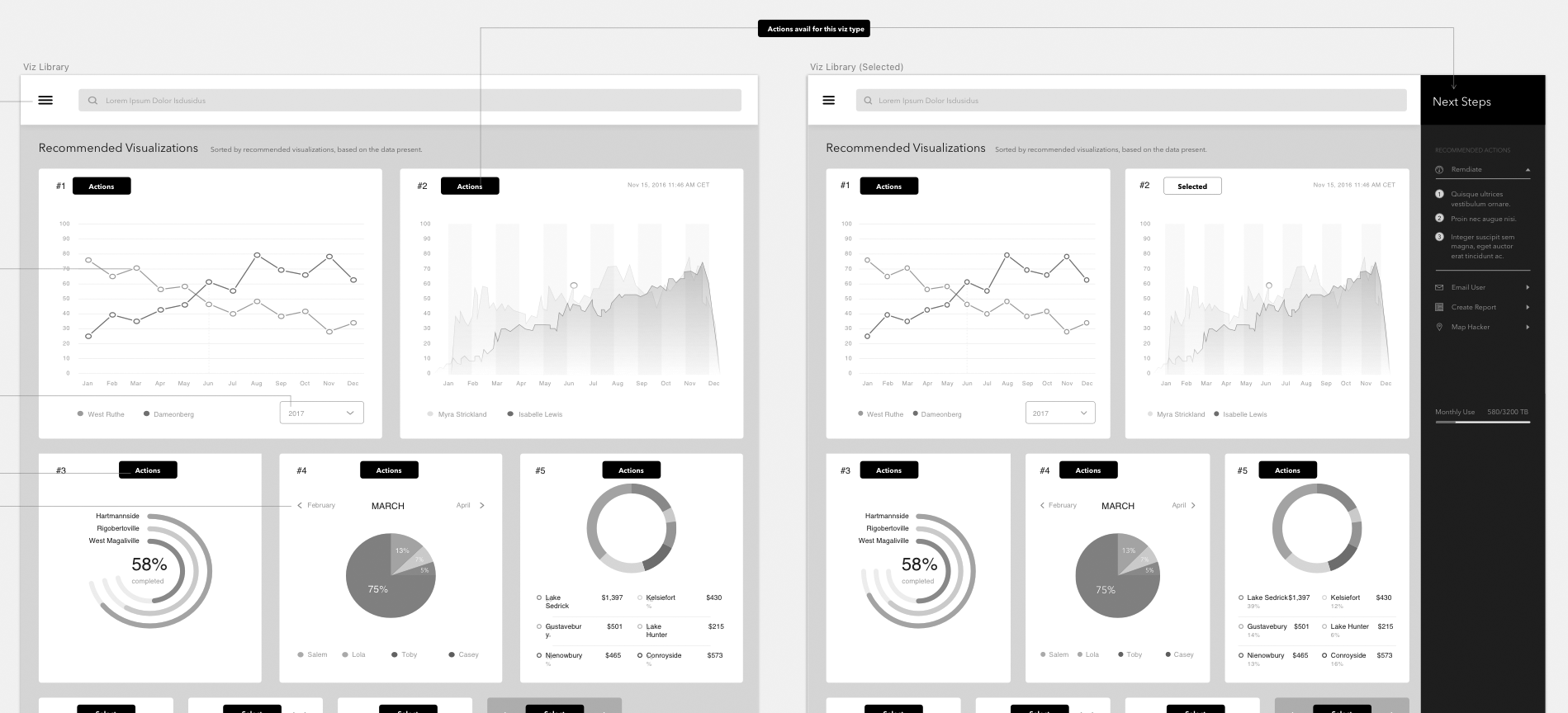
Creating multiple levels of controls, and being able to switch on intelligent data focus is a key part of making this cyber security product rise above.
Thousands of line of code, network traffic analysis and overwhelming amounts of data can be daunting, but not when it’s visualized in an intentional format.
Thus our problem presented itself: How do we simplify network traffic, so that even the most junior analyst and interpret trending information?
Strategy
The scope of our project was defined in this phase. It’s often less about what’s included, and more about what’s excluded.
Based on what our brand was trying to accomplish, defining a new model by which security analysts visualized anomalies, we decided to start small.
- Building a model, upon which we could scale out to different anomaly types was going to appease PMs at the same time delight and educate users.
- We were NOT going to cover visualizations that may be edge cases (research needed to define said edge-cases)
Since we were a leader in the industry, in terms of intelligence offered up in our product, we were going to seamlessly integrate what we do best. The guiding principles around our visual and written intelligence language, built the foundation for how we were going to communicate anomalies.
- We were NOT an open source, dump any kind of code, 3rd party javascript library that anyone could leverage. We were defining a curated experience, specifically for our users, and our data.
Research
I define this phase, not by which keywords I google, but which competitors I’m researching. Both quant and qual data were needed to tell the most comprehensive story.
Base on the available quantitative data, we survey the most common occurrences of network traffic anomalies among our current customers.
- There were a clear top four winners, with respect to the common occurrences, however among the subsequent three, there were not much difference.
- From here we interviewed internal engineers to see if there was common tech stacks that could be leveraged with the first four most common visualizations, and apply it to the next three. Based on their findings, we were able to accomplish this, offering up 7 visualization types will little extra effort.
Next, We made an intentional decision to start with the content first. (Imagine that!) Based on the qualitative data, acquired from both competitive analysis as well as interviews with potential customers (Customer Advisory board and Sales Exec’s contacts):
Users needed the support of:
- Copy & Paste code input (JSON supported)
- Multiple FIle Type uploads (CSV, XML, YAML)
- Logs from the internal proprietary query language
Finally, the ‘why’ (thanks Simon Sinek) became more and more apparent, and confirmed our user experience assumptions:
Analysts don’t know what they are looking for, until they see it.
- We set out to solve just that. Surface exactly what the users were looking for, before they saw it.
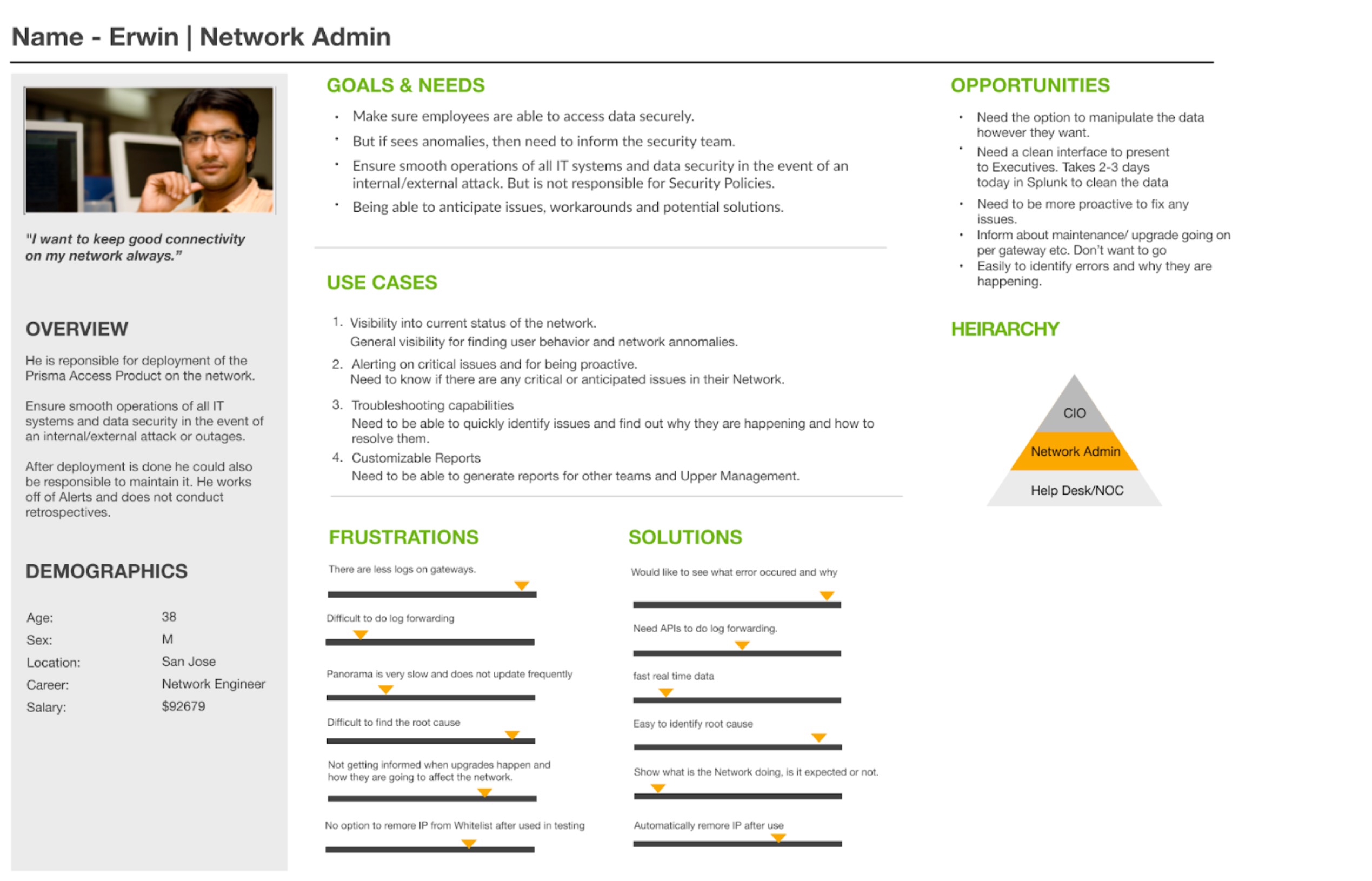
Personas
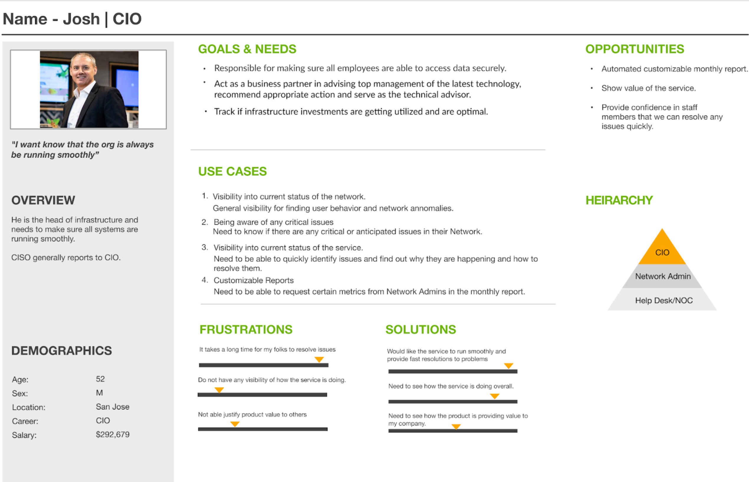
Our users were very intelligent individuals. We needed to better understand them if we were to anticipate their needs.
Here are 2 of the proposed primary users of experience we were fabricating.
Stories
As a user, I need to quickly asses if there is an attack on one of my systems, by a known anomaly type, so that I can more effectively address the issue in a timely manner.
As a user I need to better understand what my remediation actions are, based on the anomaly type.
As a user, I need to the flexibility to create a visualization from any log that I find within the product.

